UX Trends
UX Trends
The State of UX Design in 2024
 
The
State
of UX
in 2019

We have seen quite a lot this year. After curating and sharing 2,239 links with 264,016 designers around the world, we have isolated a few trends in what our industry is writing, talking, and thinking about. Here’s what to expect for UX in 2019.


Illustration: Camila Rosa

Illustration: Camila Rosa


From the editors

If you landed here hoping to find out whether rounded corners and brutalist typefaces will be trending in 2019, we have some bad news. This is not an article about UI trends — you’ll find those on Medium every week, produced by specialized publications.

Our annual report is a holistic analysis of UX Design as a discipline: the tools we use, the methods we apply every day, the technologies we design around, the career challenges we experience, and how our community is responsible for what's happening in the world around us — the one that we, consciously or not, have helped design.

This is the fourth year in a row that we’re publishing our trends report (which has us wondering—at what point exactly does something become a tradition?). The response we received last year was so overwhelmingly positive it inspired us to go even further in our exploration. We embarked upon this year’s report knowing that we must be even more critical of our work, with a deeper awareness of our responsibility as designers and an understanding of our broader impact on society.

We are looking forward to how design will evolve in 2019. Meanwhile, here is our review of the past and analysis of the present, with an ever-watchful eye on the future of UX.

Hope you enjoy the ride,

Fabricio + Caio
 
 
UX_Trends_2019_BG.jpg
 
 
#1
Everyone is a lead

You’ve finally scored that “Design Lead” title. Exciting, right? Until you look around and see that everyone else has a similar title. When everyone is a lead, is anyone a lead?

A decade ago, most designers were new to digital design. Two decades ago, everyone was new. There was something exciting about being the trailblazers helping to define how User Experience, as a profession, would evolve.

Designers are getting old. Today, it’s not uncommon to find folks with 15 or 20 years of professional experience in digital design. These are the people who have evolved their craft over the course of time to adapt to new processes and tools; they’ve taken leadership roles in our industry to help train and shape the next generation of designers.

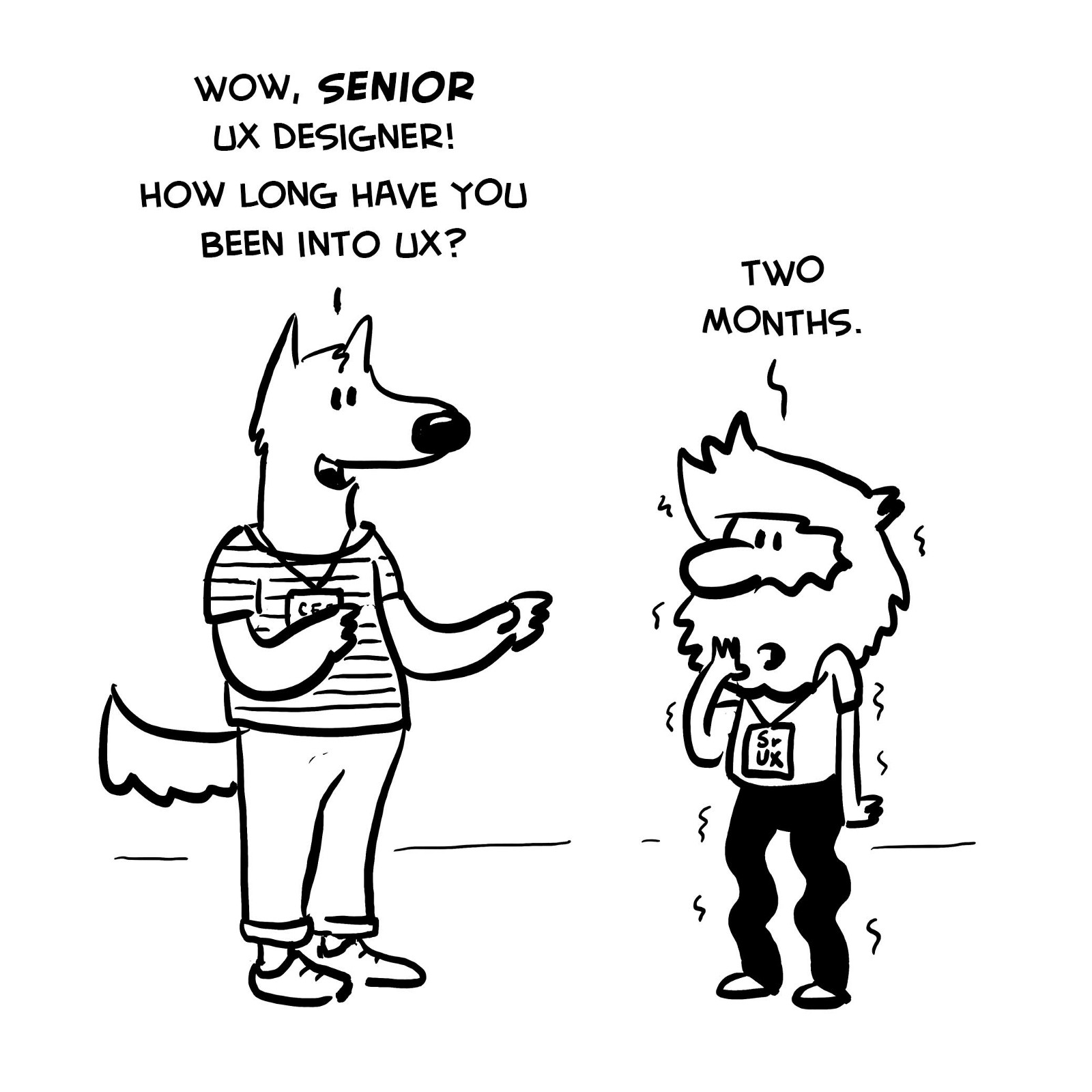
However, the way we break down job title requirements by level is rapidly becoming antiquated. Generally, in the United States, it goes like this: after two years Associate Designers become Mid-level Designers; after four years they become Senior Designers; after six they become Lead Designers. Not to mention the recent phenomenon of designers who acquire a Senior title less than a year after school.

 
Credit: The Design Team, by the awesome Pablo Stanley

Credit: The Design Team, by the awesome Pablo Stanley


Since the rise of bootcamp design schools in the early 2010s, thousands of new designers are entering the market each year, a faster turnaround time than that of graduates who enter the workforce after completing traditional education programs. And all of them are now getting their highly anticipated Design Lead title.

We are building an industry full of lead- and director-level designers. The current ratio between managers and individual contributors is so unbalanced that it's not uncommon to find managers/leads of teams of one.

In the long run, that top-heavy structure might not be sustainable. Paying lead/director salaries to individual contributors inflates our industry, while fancy job titles create the false expectation that someone is being hired to manage and not to produce designs — leading to frustration and low retention rates. To help fix that, some companies have been creating official documentation that outlines roles and responsibilities for each level to avoid mismatched expectations.

Everyone is looking for Seniors

Everyone is looking for Seniors

From a high-level perspective, we are seeing a clear differentiation between the seniority levels implied in job titles and the actual impact designers are having in their organization.

  • Seniority levels used for job titles. Associate, Mid-level, Senior, Lead, Manager, Director, Group Director, VP. The list of titles for designers continues to expand, with new labels and levels and variations continually added. The goal is to attract new hires who are on the lookout for a senior-sounding position, while keeping current employees motivated, rewarding them with a shiny new position every other year.

  • Independence and power within an organization. Although unspoken, company heads are starting to think about their employees in two main buckets: juniors and leaders (which certainly do not map to the title “Associate” or “Senior” titles from the first group). Seniority is becoming less about years of experience on your resume and more about your mindset, your behaviors, and your ability to influence change in the organization, whether that’s through state-of-art interfaces or pure thought leadership and articulation.

In 2019 we should start looking at seniority through new lenses. You can be proud of your “lead” title, as it is an integral part of your growth story. But if you consider seniority from the perspective of how much impact you are able to make (or not) within your organization, you’ll have a better sense of where you are along your career trajectory and of how your particular skills and experience are influencing others around you and our industry as a whole.


#2
Designers are too busy to design

We are busy being busy. Busy preparing the A and the B variations to test, busy setting up remote testing sessions, busy updating the prototype URL in the Trello card. To keep our heads above the water and be able to scale our practice, we need to rethink how we focus our time.

The frenetic pace of our industry’s hyper-growth mindset has made us bad at design. We are investing so much energy in everyday tasks that it feels like a big part of our process has been taken over by the need to move faster and meet unrealistic business goals.

We are heads down discussing whether that hex color is on- or off-brand, ignoring the fact our brand guidelines haven’t been revisited in more than three years. Are we spending our energy in the right place?

Habits are hard to break. We have become quite attached to the methods we use each day. We aim for efficiency and reliability, but in doing so we get trapped in our little comfort zone. We ask for clear goals and a clearer roadmap, but we get stuck iterating the same feature over and over. We want to be bold in our vision, but we get stuck in group thinking. We want to learn from research, but we don’t have the bandwidth to act on the insights we receive.

When we finally become aware of our inability to make progress, it is often too late. The next step, often, is to pause day-to-day work to rethink our longer-term vision and strategy. Many times, we hire an external consultancy firm to do the thinking for us. While it can be insightful to bring fresh eyes to a problem, strategic explorations shouldn't be outsourced entirely or framed as a one-off project. They should be part of our everyday decisions. They should be part of our company ethos.

What is a strategy after all?

Paraphrasing the definition from Playing to Win, by A.G. Lafley and Roger L. Martin: a strategy is just an integrated set of decisions that we make all the time.  

Simple, right?

Here’s what strategy is not:

  • Strategy is not (just) a vision: you need to plan, act, and iterate. Strategy needs to be realistic and help achieve tangible business goals.

  • Strategy is not (just) a plan and guidelines: if you have a vision, but not the resources, it will never be materialized. If you follow guidelines and best practices, you will have a good product, but it might not be a successful one.

  • Strategy is not (just) optimization: yes, successful products must be continuously optimized. But that can't be our whole plan. Often, there is some resistance to long-term planning in the tech industry, but if you’re solely focused on small optimizations, you might be missing out on more significant opportunities.

  • Strategy is not complicated: it's about making simple, courageous choices about what you will and will not do to keep the company focused and in motion.

How can I be more strategic at work?

You still have to deliver on your daily tasks, but you also have to find a way to break the bad habit of having your work on autopilot:

  • When designing, start with a concept. Concepts are simple metaphors we can use to help people understand how a system will work, before getting too attached to the details.

  • Prototype the most radical idea first. As Jason Fried said: “When prototyping, always try wackier/quirkier stuff first. The deeper you get into a project, the more conservative it tends to get. Stranger ideas are more at home earlier in the process.”

  • Advocate for less. Or as Julie Zhuo states: prioritize and cut. "When the discussion becomes ‘should we ship this mediocre thing, or should we spend additional time that we don’t have to make it better?’ the battle has already been lost. The thing we failed to do weeks or months ago was cutting aggressively enough. Either this thing matters, in which case make it great — don’t make it mediocre. Or it doesn’t, in which case, don’t work on it in the first place."

  • Practice zooming in and zooming out of your designs: force your brain to be idle; test your design in a different screen (print them out!); share your design earlier and often, talk aloud about it; write a summary of your idea; write the case study while you work on it. It’s all about creating the habit.

  • Be patient. We like intensity. We love things that are fixed in time and easily measured. But only by staying with it for the long-run will the vision be delivered. Consistency, patience, and hard work are the keys to good design (and any other work, really).

Our industry is changing. The world around us is changing. We can't keep doing business as usual. Soon, most of our daily tasks will be automated. If we keep our heads down, we will miss multiple opportunities for doing something more meaningful.

In 2019, we need to create time and space to stay relevant, experiment, and think more broadly about our work. Our value and impact are not defined in a feature request, but by bringing the design vision to every decision we make.


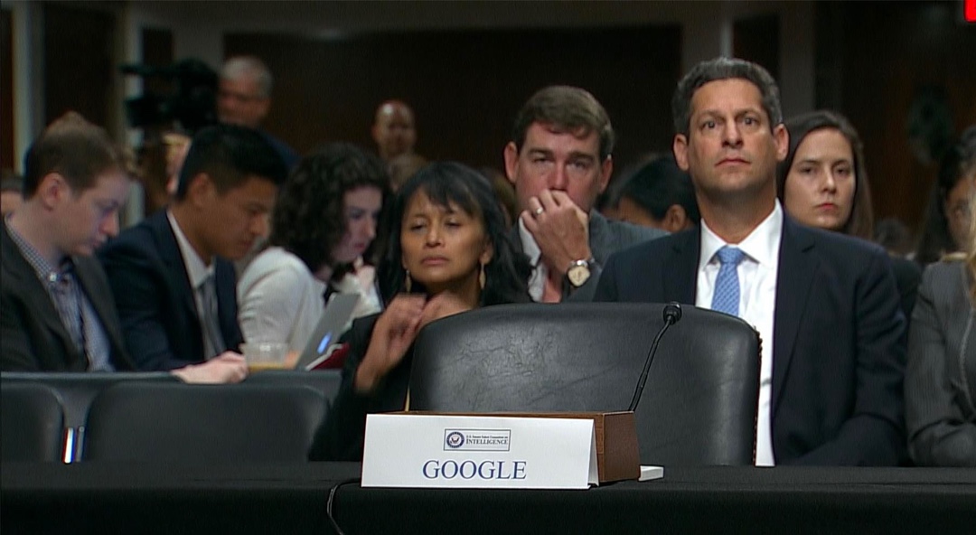
Micro-trend for 2019: tech executives testifying in court. Photo: Capital

Micro-trend for 2019: tech executives testifying in court. Photo: Capital


Photo: CNBC

Photo: CNBC


Photo: DigitalTrends
 
Photo: NBC News

Photo: NBC News


#3
Design is not saving the world

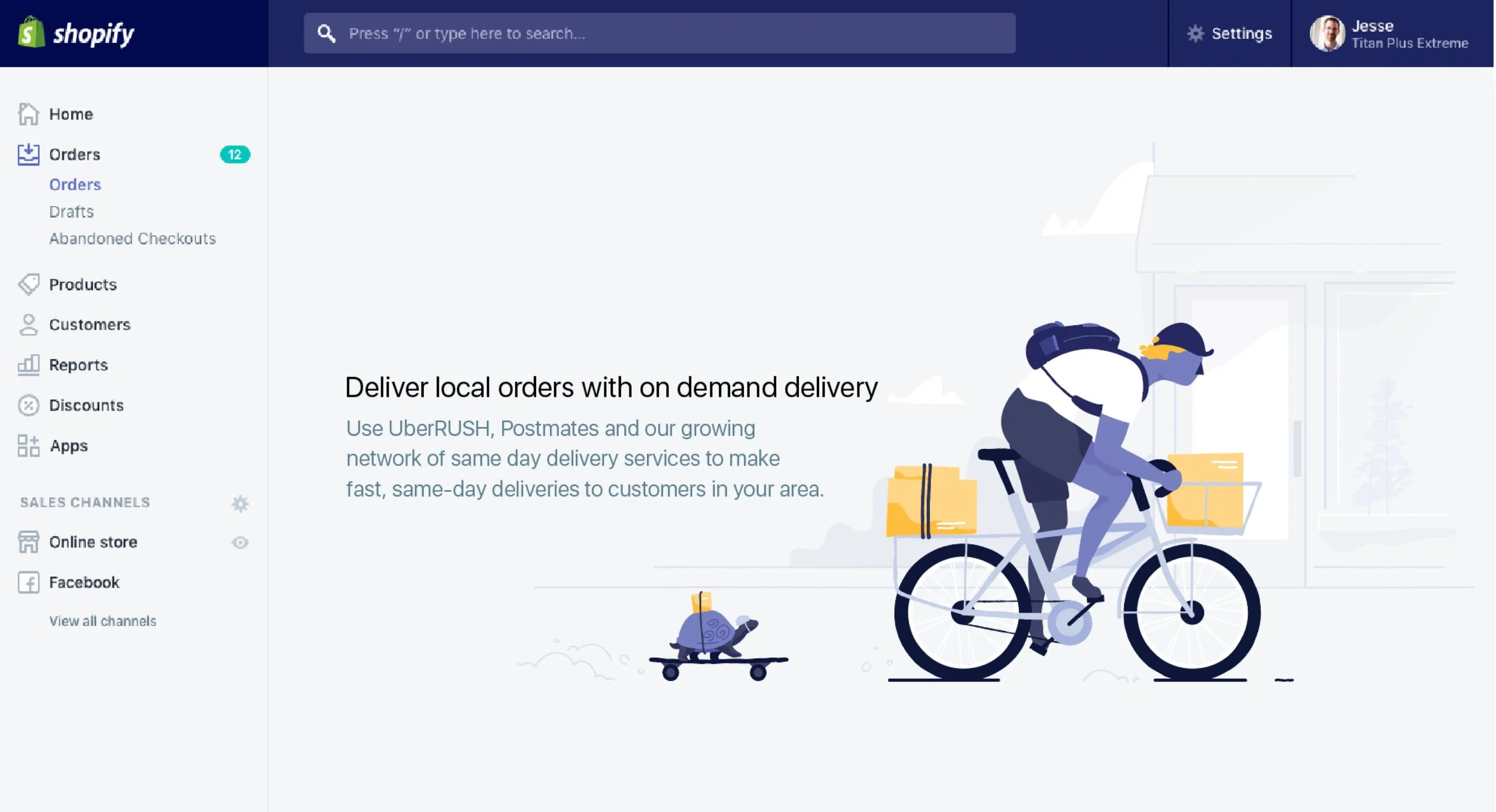
Facebook is using billboards to demonstrate their commitment to fighting fake news. Uber is running TV spots to illustrate the company’s commitment to doing good. Once considered disruptors, digital companies are now using the same strategies oil and tobacco companies used back in the 90s to project the illusion of an optimistic future — while their design teams are still tied to aggressive, revenue-driven, short-term metrics.

Tech companies have often been on the wrong side of the conversation for the past few years, by creating tools and systems that support unhealthy business practices in the pursuit of growth. For decades, we have been solving problems and running businesses that took advantage of laws that were not quite ready for digital services and social media. That worked well for some time, but we have now reached a point where we can't consider these once new digital services to be outsiders. Their impact is felt in the economy, in the politics, and in people's lives.

Credit: Facebook

Credit: Facebook

Credit: Uber India

Credit: Uber India

To clean up their image, companies are resorting to the traditional model of running branding campaigns that attempt to make things look better than they actually are. But once the damage is done, it gets trickier to redesign an entire business or service.

We can't think of people like we think products; we cannot fix human behavior in a two-week sprint.

The damage these companies are creating in the world around us serves as a reminder of how much tech needs to improve and how much we have failed so far. As Erika Hall, co-founder of Mule Design, said: "Pleasant to use doesn’t equal healthful any more than pleasant to eat does."

Building a healthy business is a long-term endeavor. However, if sustainability and positive impact are not at the core of the company, the design approach will be constrained by a limited scope and the metrics of their day-to-day projects.

It took businesses a while to shift their focus from being business-centric to being user-centric. We are now quickly approaching a new era where the companies that win are the ones who can shift from user-centric to society-centric — from singular to plural.

The golden handcuffs of Silicon Valley

The comfort of our design jobs, especially in Silicon Valley, has, in many ways, limited our power to advocate for the right thing. We are comfortable in our expensive chairs, busy pleasing our internal stakeholders and pretending we can keep our responsibilities as citizens out of our work, and the impact of our work out of our personal lives. For a long time, we even ignored harassment issues in our offices.

But no longer. It’s time we reach beyond our short-term goals and metrics to start discussions about the broader impact of our decisions.

When did we let this become the norm? Source: David Teodorescu

When did we let this become the norm? Source: David Teodorescu

“But I don’t work in a big tech company…”

While big tech companies are constantly in the spotlight, all designers are in the same situation. The size of your company doesn’t matter, it’s the mindset that you and your employer have that impacts the work you produce. A good question to ask is: what would be the impact of my design decisions if my product had one billion users?

"Focused on improving people's lives" sounds great on our Linkedin profile, but it’s hard to put that in practice. The reality of our work is way less glamorous than that.

We still have responsibilities after 5 pm

What if, instead of working on unsolicited redesigns after hours, we put our craft to work in other initiatives and sectors that are in need of designers? Many non-profits out there can benefit from our thinking.

What if, instead of coming up with a better version of the "double-diamond model," we mentored new designers and other professionals and guide them through applying it to their own careers?

As designers in 2019, we have to take a stand on what we believe in and what we want for the world. We might not have the answers yet, but we can add a lot of value by asking the right questions. The time to start fixing things is now.


Micro-trend for 2019: blue people in illustrations.  A shortcut to solve all of your company’s diversity problems.

Micro-trend for 2019: blue people in illustrations.
A shortcut to solve all of your company’s diversity problems.

 
Blue people in illustrations 4.jpg
 
 
Blue people in illustrations 3.jpg
 
Blue people in illustrations 6.jpg
 
Blue people in illustrations 2.jpg
 
Blue people in illustrations 5.jpg
 
black.jpg


#4
Designing for less
Designing for less
Designing for less
Designing for less

For years, we've been designing with engagement as our key metric: get people in, get people back, get people to use our product as much as possible, several times a day. Now, as users, we're starting to feel the effects of having our attention kidnapped by too many services — and companies are feeling the backlash of seeing engagement decrease. How do we design with healthier behaviors in mind?

Aggressive KPIs. Short deadlines. Bonuses that are tied to performance and to higher engagement metrics. The sad reality of the corporate world has forced designers to come up with new ways of engaging our audience.

The Hook Model, by Nir Eyal — still one of the most talked about design frameworks of the year.

The Hook Model, by Nir Eyal — still one of the most talked about design frameworks of the year.

We have become really good at accelerating engagement. As an industry, we have created incredibly refined frameworks that try to explain the science behind engaging products. We have deified products like Instagram or Tinder for their unashamedly addictive qualities. We have learned and taught each other how to design for addiction, always thinking of reasons for people to come back to our product begging for more.

The engagement pendulum has gone all the way to one side. It’s now starting to swing back.

Users are starting to feel the effects of years of addictive digital behaviors. From 33% of divorced couples citing Facebook as a reason for their split, to gamers who die of starvation after binge-playing for several consecutive days, to more extreme cases like the Youtube campus shooter who was allegedly angry at the company’s monetization policies. Companies are getting a lot of pushback and being questioned about their responsibility in this behavior shift. Society is awakening to the need of establishing a more mindful relationship with technology. It is a potent public health topic now.

Time to get a life

Time to get a life

In 2018, we have seen a few companies move towards healthier experiences — or at least they’re advertising that they do so. Apple’s iOS12 has introduced new features that reduce interruptions and give users a more transparent view of how they are spending their time on their iPhones — and so have Youtube, Facebook and Instagram.

A few more examples:

While these may seem like a lot of work, they are actually quite easy to do. These relatively small changes are incredibly powerful in how they impact society.

UX is not only about the times when people are using our products, but also about the times when they are not. In the era of ever-vibrating smartphones and increasingly demanding apps, there is no better user experience than peace of mind.

Amber Case’s recent book on Calm Tech (inspired by 1995 Mark Weiser’s paper “Designing Calm Technology” and covered in our 2017 report) outlines a few principles for how technology should be mindful of its impact in the user’s life.

  1. Technology should inform and create calm

  2. Technology should make use of the periphery

  3. Technology should amplify the best of technology and the best of humanity

  4. Technology can communicate but doesn’t need to speak

  5. Technology should work even when it fails

  6. The right amount of technology is the minimum needed to solve the problem

  7. Technology should respect social norms

With great power comes great responsibility

As designers, we have both the power and the responsibility to implement these principles. The same way we take pride in limiting our red meat consumption to avoid cardiovascular diseases and protect the world resources, or campaign against smoking, designers can be the ones advocating for healthier UX.

We are the ones who can push back next time someone proposes to add infinite scroll to a social feed.

Or videos that autoplay.

Or popup forms.

Since we are equipped with research-proven user insights, we are the ones who have the power to push for business metrics that are not measured in old-school standards — like views, pages per visit, or dwell time.

We are the ones who can call out a “Growth Hacking” idea for what it really is: a vicious cop-out solution.

We are the ones who can help our teams choose better metrics.

This trend of people wanting products and services that fulfill their needs while respecting their time will only accelerate in 2019. Instead of fighting for attention, the products we design should be striving for relevance and comfort. Our KPIs will start to shift from engagement-centered metrics to affinity-related ones. Ultimately, our metric will become making sure users themselves are achieving their own personal KPIs. Not because we are benevolent gods, but because it’s part of our job. And because users will demand so.


#5
Our obsession with design methods

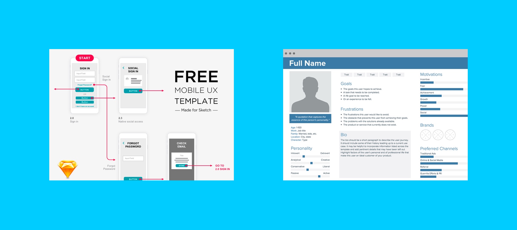
Google has made us lazy: “How to make a diary study”; “When to use a hamburger menu”; “Persona template PDF”. A few searches later, we find ourselves following a step-by-step guide created by someone else. And, just like that, we forget the critical thinking aspect of our job.

In the past few years, design has become more accessible to more people. Design firms like IDEO, Frog, and Cooper have done an outstanding job standardizing and popularizing certain design methods. Companies with strong design teams like Google, Airbnb, and IBM have done a similar effort elaborating and sharing design systems, workflows, libraries, and best practices. More and more we rely on resources we have available to jump-start any project.

Everything we need to know about design is a few clicks away

Everything we need to know about design is a few clicks away

The issue is that companies are competing for those same search terms, creating formulaic solutions in exchange for a second of your attention. We trust them more than we should. After all, it's hard to say no to a solution that’s free and easy to implement. While predefined methods can be a great starting point, they can't be the end. For every article defending a method, there are three going against it. Which one will you believe? Can you apply the same method for every single project? Can you simply copy a competitor and call it a day?

Pressed to deliver answers to our teams and keep the project running, we resort to canned design methods and forget the analytical, creative part of our jobs.

As an industry we have become obsessed with our design methods. Some designers are so addicted to following the specific set of steps outlined in a playbook, or filling out a persona template that they found online, that they forget to reflect on why they are using that method in the first place. That extreme focus on output rather than outcome can be extremely dangerous to Design as a profession , creating a whole generation of designers who always have to be told what to do next.

The impact on research

Research is the step of the process that suffers the most from canned methodologies. Being restrictive about a specific research method can also impact how much empathy you have for your users and your team:

  • By forcing everything to fit a certain box, we miss nuances and opportunities to approach things differently and learn about the diversity of users, scenarios, and contexts we could be designing for.

  • By being inflexible in our process, we lose our team's trust and make our day-to-day a burden rather than a collaborative learning experience.

  • By neglecting to think critically about what we are doing, we are only feeding pre-existing bias behind our actions and way of thinking.

We should be thinking more about methodologies rather than methods. We must understand what questions we need to ask instead of starting from the answers we want.

As Joe Munko, User Research Director at Microsoft, insightfully states in his article Skip User Research Unless You’re Doing It Right — Seriously: “Timeless research is really about building long-term organizational knowledge and curating what you’ve already learned”.

In 2019, we should not let our obsession with methods replace our ability to analyze and critically think about our work. Design is about solving problems. And deciding how to solve a problem is the first design problem to be solved.


RIP: some of the products that died in 2018

RIP: some of the products that died in 2018

 
Path app — one of the products that died in 2018.jpg
 
TBH — one of the products that died in 2018.jpg
 
Stumble Upon — one of the products that died in 2018.jpg
 
Eat24 — one of the products that died in 2018.jpg
 
Digg Reader — one of the products that died in 2018.jpg
 
Youtube Gaming — one of the products that died in 2018.jpg
 
Snapchat — is it dying in 2019?.jpg


#6
Should designers design tools code?

Every couple of weeks we see a new article come up that tries to answer the good old question: should designers learn to code? Our industry is finally reaching a point where we are able to step back and reframe that question altogether.

There are two fundamental arguments used by those who defend the fact that designers who learn to code become more valuable than others:

  • First, by creating prototypes that are as close as possible to the ultimate intent of the desired experience, it becomes more likely that it will be executed by others appropriately — if not by the designer itself.

  • Second, the more a designer can speak the language of their developer peers, the better they can collaborate to get to a stronger final product.

Of course designers should know how to code. This is about being a good artisan and knowing the materials you’re dealing with.

Of course designers shouldn’t spend all day creating code. This is as inefficient as asking an architect to build a wall herself.

However, it turns out we were asking the wrong question all along.

As Dave Malouf points out in “To code or not to code? OMG! This is totally the wrong question”, while both of these arguments are truisms and irrefutable in their framing, they also continue to ignore all of the data that suggests that there are consequences to these truths — creating a unique paradox of logic.

Relying on designers being able to code can be a symptom of systemic oppression in the workplace. “As a designer, I will go out of my way to speak the language of those who hold power, to assimilate, so they will trust me. At the heart of this [contradiction] is the foundation of anthropology and the notion of balancing the outsider and insider perspectives to bring understanding through comparison. I am only as valuable as a designer as I am able to maintain that balance between the outsider and insider perspectives and to hold the mindset of student/apprentice.” — states Malouf.

In parallel to this never-ending discussion, we have been observing an ongoing evolution of the design tools we use everyday that enable designers to go back to focusing on what they are really good at: designing (big surprise).

In 2018 we have seen a few transformations that corroborate that trend:

  • Principle has become one of the most popular UI prototyping tools, requiring almost zero knowledge of coding and native coding languages;

  • Companies like Airbnb have developed internal workflows that allow designers to sketch a UI on paper, and spit out code in a matter of seconds, bridging the gap between designers and engineers working on design systems at scale;

  • New tools like Framer X and Modulz have evolved to be able to automatically translate UI patterns into React components, which means in most cases developers can build upon designs instead of replicating them in production;

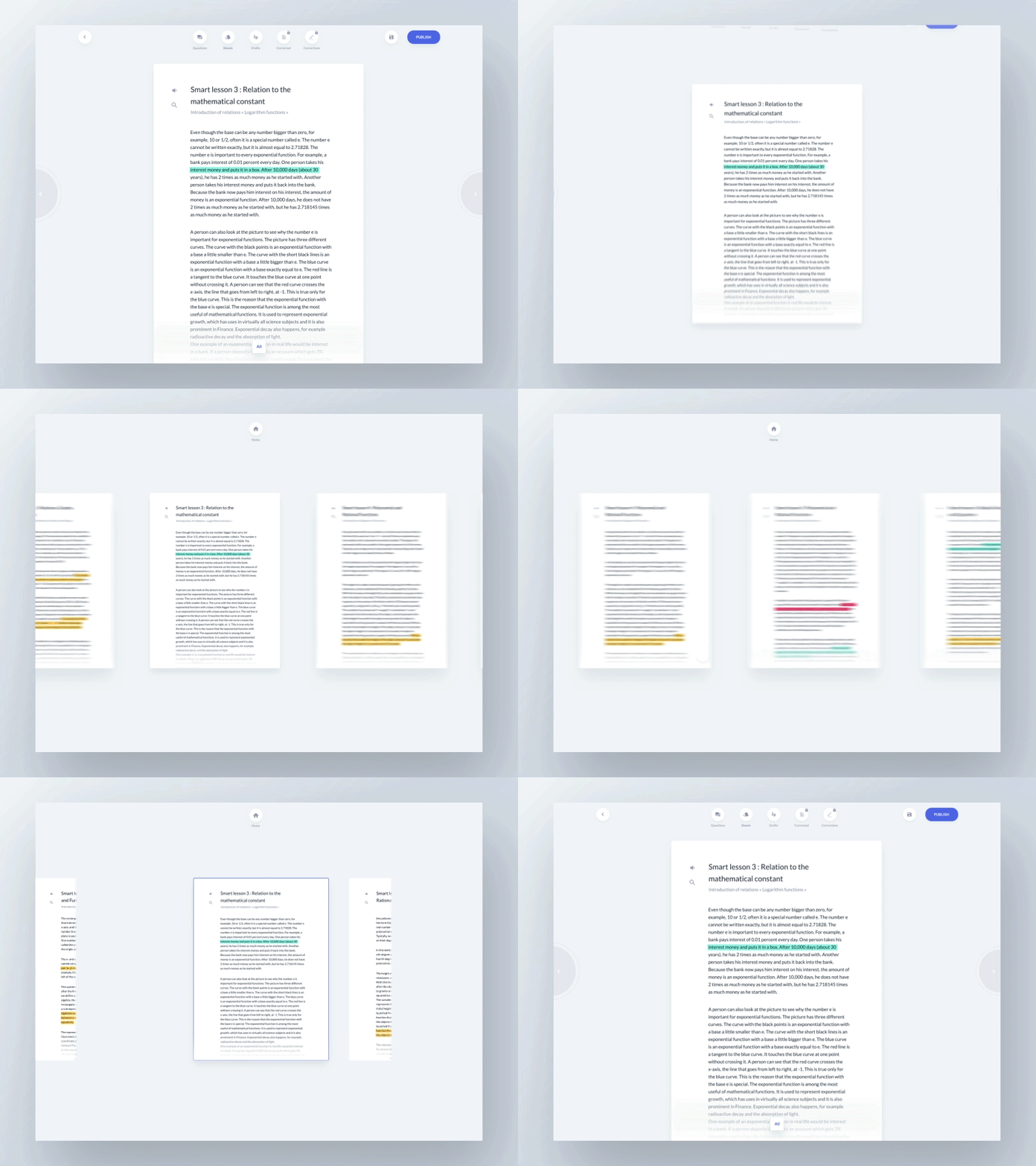
  • Tools like Hadron App have started to unify Design and Dev workflows into a single UI that has two distinct “views”.
Hadron App: one tool, two distinct views

Hadron App: one tool, two distinct views

Our tools shape the way we think. While knowing how to code certainly helps designers ensure they are coming up with technically feasible interfaces, there is a new wave of tools that are gradually taking on the responsibility of making designers think in terms of components and design systems.

Design tools that are focusing on the design-dev collaboration have a competitive advantage over the ones that are solely focusing on fancy animations and gimmicks — or other things that will only benefit the designer-designer-please-like-my-dribbble-shot need for validation.

In 2019, we will see more instances of design tools that “know how to code”— designers putting machines to work for them, as opposed to having to learn an entirely new discipline that is foreign to their craft. It will also be the year when we stop thinking in terms of “dev handoff,” and start thinking in terms of integrated workflows.


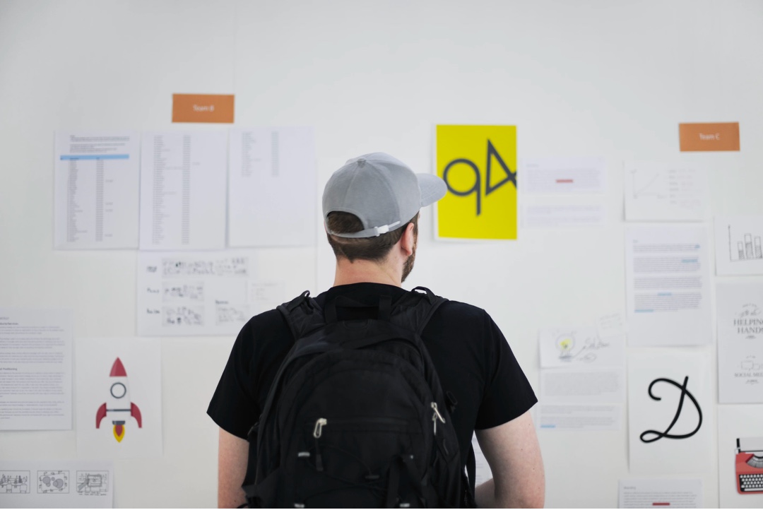
Sea of sameness: the most popular stock photos of the year are a mix of sticky notes on the wall and white male design stereotypes. Source: Studio Republic

Sea of sameness: the most popular stock photos of the year are a mix of sticky notes on the wall and white male design stereotypes. Source: Studio Republic

 
Source: Kelly Sikkema
 
Source: Pexels

Source: Pexels


Source: Rawpixel

Source: Rawpixel

 
Source: Pexels

Source: Pexels


Source: Rawpixel

Source: Rawpixel

 
Source: Headway

Source: Headway


#7
Thinking outside the artboard

Gone are the good old times when we could create a prototype by simply linking screenshots. Gone are the good old times when digital interfaces fit perfectly within a two dimensional, rectangular artboard. As interactions evolve, the artboard metaphor needs to evolve as well.

The artboard has been our digital, creative canvas for years. It is an extremely effective metaphor for print design that worked well for digital interfaces. It has since evolved to accommodate responsive design, prototyping, and component management.

But it still has limitations.

Artboards are not how people will experience your design

The user won’t always have your UI in full screen. They will have several other tabs open in their browser, notifications popping up, wellbeing apps modifying their screen brightness and saturation — and so on. While at the beginning of the project artboards are a great place to drop ideas and run visual explorations, using them as the only way to visualize your work can create the false illusion that people will experience your interface in a sacred and uninterrupted way.

Google Calendar living on the right side of Gmail: users expect to be able to transition across products seamlessly

Google Calendar living on the right side of Gmail: users expect to be able to transition across products seamlessly

Artboards can mislead your way of thinking

Artboards represent your product interface, not its experience. More and more products are seamlessly connected to a broad ecosystem of services and platforms, making it harder to design products in isolation. Google Calendar living on the right sidebar of Gmail is an excellent example of how users don't expect to leave their email application to check their meetings. The tasks of each product are performed within a certain mindset and flow, rather than a rigid logic.

The same way a photograph captures a moment that never existed in isolation, artboards are only able to capture a single point in time of your product experience. Artboards are the script, but not the movie.

New technologies will require new metaphors

Voice, augmented reality, virtual reality, platform integrations, social channels. New technologies require us to abandon old mental models of what it’s like to design a web experience, for example.

Think about game UI for a moment: how do you perform so many tasks without moving to a different screen in the game? How do you navigate a complex game like Red Dead Redemption 2 with so few interface elements? Controls appear only when they become relevant, over the cinematic gameplay. Good luck trying to communicate those dynamics on static artboards.

Red Dead Redemption 2: the best interface is no interface at all

Red Dead Redemption 2: the best interface is no interface at all

We can do a creative exercise that brings this same concept to an enterprise app. What would the user experience and interface be like if the app was just an overlay over the other tasks?

Creating a new artboard is the wrong first step in designing for connected experiences. Still, that’s how we start 99% of our projects.

A few design tools are starting to explore new ways forward. Adobe XD recently launched a voice prototyping feature that has a lot of potential, but is still modeled around artboards. Figma uses "frames" instead of artboards. While similar to artboards, frames have an interesting way of connecting and embedding.

Since artboards are not going away anytime soon, here are a few things we can do to avoid locking ourselves into the boundaries of static thinking:

  • Share a story, instead of a wireframe. Instead of focusing on single pages, think about how features will work around the user journey. What else are they going to be doing? Where are they coming from, and what will they do next? How does the interface adapt over time?

  • Work and present your designs in context. Instead of presenting a mobile prototype from Keynote or Principle on your laptop, show it in a device similar to the one your audience will use. While designing, make sure to go back and forth between your design tool and the user’s device as much as possible.

  • Think about components and states rather than pages. "Pages" impose a certain linear thinking that is often not how the user will experience the product. Breaking down a feature into a set of possible actions and further breaking that down into interface components allow us to see where these actions make sense and how they can be incorporated into the broader ecosystem.

In 2019, designers need to be focusing on journeys and mindsets more than a series of static screens that will never be how the user actually experiences their product. What if we questioned why we are doing what we’re doing more times throughout our day?


Move, baby, move: some of most famous moving shots of the year. Source

Move, baby, move: some of most famous moving shots of the year. Source


#8
Embracing the open kitchen

For a long time, designers have been protective about their process. Being a designer meant being part of a secret, sacred group. Building mystery around the creative process has made us seem uniquely valuable for the people who would hire us. Not anymore. It’s about time we embrace a more open approach to the way we design.

In the early 2000s, reviewing recently launched websites created by another designer or firm brought about a mix of admiration and magic. As soon as a new product went live, designers and developers would inspect the code to understand how they accomplished that feat. They would pause dribbble animations frame by frame to study which parts were moving, and how.

Fast forward to 2018 and we’re doing a much better job at sharing our process:

Photo credit: Marisa Peralta

Photo credit: Marisa Peralta

Modern restaurants started to embrace the open kitchen model once they realized customers were not only interested in purchasing the food that they had to offer, but were also craving a more holistic experience of dining. And they saw that people were willing to pay extra money for that experience. Customers value the craft much more once they see what it takes to create high-quality dishes at lightning speed.

The same open-kitchen model has started to permeate the design industry as well.

Our employers and clients are buying way more than our technical skills. They are buying our authenticity, our transparency, our openness, our ability to collaborate with our peers, our ability to recover from failures. This transformation in the way companies buy design is making designers realize they are selling a process, not a deliverable.

Increased openness about our design process has benefits for the designer, for the design community, and for society at large. Democratizing access to knowledge, tools, and methods will generally enable more designers to execute design — which means a bigger impact of our craft in everyone's live.. Participating in design and in the design community should not require any type of membership, and should not be hidden under a paywall. You shouldn't have to have any kind of membership to participate in the design discussion.

We must proceed with caution as we open our process to more people as it will be tempting to get swept away by “likes” and “claps.” We can lean on two guiding questions as we embark on this new territory: 1) How do we avoid creating a culture of celebrity chefs in design? 2) What can we learn about sharing work in an open-source and collaborative way (GitHub and the development community have some good ideas)?

Starting in 2019 we will see designers sharing their process more often — and the gap between doing the work and sharing it with the world will shrink exponentially. Demonstrating our authenticity and sharing our experience will be worth way more than positioning ourselves as magicians that are secretly concocting sly tricks.


#9
Making tech work

Every year there is a shiny new technology, topic, or buzzword that permeates everything that is written and published in UX. That has been the case in our recent reports (Artificial Intelligence in 2018, Chatbots in 2017, the Internet of Things in 2016) and in the years prior (responsive design, augmented reality, and so forth).

Not this year.

There hasn’t been a ground-breaking technology that has made designers stop in their tracks. There hasn’t been a game changer of any kind.

Partially because tech hasn't advanced enough to create disruption.

Partially because we've had more important issues to attend to.

Partially because we’re still educating ourselves about how to leverage existing technology in a way that feels relevant to people’s everyday lives.

If you look back at the topics we were all obsessed with over the past 3 years, not one of those technologies has been fully mastered. The internet of things has only seen a few reasonable use cases go mainstream. Chatbots continue to fail except when used for completing very specific tasks. AI has just now started to be noticeably incorporated into products we use every day — but still, only a handful of companies are applying it to mainstream products and if you don’t work for those companies, chances are strong that you are more of a spectator than an agent of change.

This can be a good thing: maybe it's a sign that we have stopped obsessing over the new. After the rush to discover the newest, greatest tech, it’s time for us designers to help make tech work to its fullest capacity. Understanding how, when and, most importantly, why we should implement a new way of doing something. This can also give us more time to understand our role in a society influenced by fake news, tech addiction, and growing economic gaps.

In 2019, we should be thinking about:

  • How to fix technology that is not working: from user research that can help us understand genuine needs to usability improvements that will streamline the adoption process — if adoption is necessary at all, that is;

  • Relevant use cases on how to incorporate existing technology in people's lives in a meaningful, calm, and sustainable way;

  • Ideas on how to bring new technologies to more people, at low cost, without sacrificing their rights, privacy, or local economy;

  • How to ensure technology doesn't hinder the great experiences in the products we are designing every day. We are here to solve people's problems, whether we use technology or not.

It’s time to make things better.


2018
Highlights

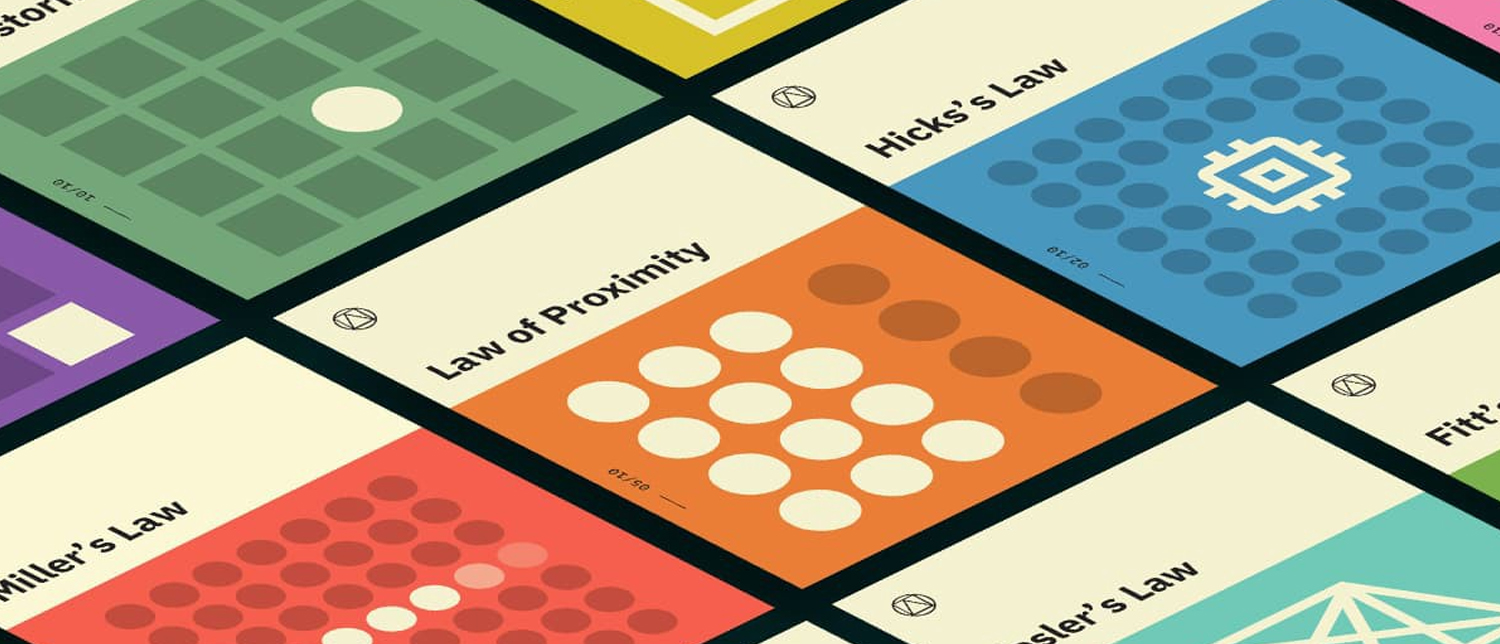
Laws of UX project screenshot.jpg

Project of the year: Laws of UX
For making complex psychology laws accessible to more designers.

 
Square Register photo.png

Product of the year: Square Register
For seamlessly integrating software and hardware in a multi-screen experience, at scale.

 
Fake News game screenshot.png

Game of the year: Fake News Game
For challenging our collective ability to distinguish between what's true — and what’s not.

 
Liz Wells' portfolio screenshot.png

Portfolio of the year: Liz Wells
For the variety and depth of projects that show design beyond pixels.
Honorable mentions to Aaron Lewis and Shawn Park as well.

 
Whimsical App website screenshot.png

Tool of the year: Whimsical
For allowing designers to think at a high-level without getting stuck on pixel pushing.


Buzzword of the year: [Anything]Ops
DesignOps, ResearchOps, MotionOps


Blog of the year:
Subtraction, by Khoi Vinh
For consistently pushing the design community to think outside its own boundaries.


UX writer of the year:
Nikki Anderson
For bringing fresh perspectives on user research and other things.


Book of the year:
Conversational Design, by Erika Hall
For reminding the design community conversational design is a mindset, not a chatbot.


Talk of the year:
Empowerment in an Era of Self Validating Facts
— Margot Bloomstein for the World IA Day 2018