UX Trends
UX Trends
The State of UX Design in 2024

The State of UX in 2023

A vibe shift
is coming


In culture, as well as in design, things sometimes change at an accelerated pace, and a once-dominant social wavelength can suddenly start to feel dated. The year 2023 brings the culmination of various changes in the realms of technology, behavior, and society that have been underway since before COVID. As designers, instead of simply flocking from one new thing to the next, this is the time to think critically about the direction our industry is heading —and the path we want to walk ourselves.


Eye crying with animated scribbles over it

Written by Fabricio Teixeira and Caio Braga
Art direction by Manoel do Amaral
Frame 52134.jpg
 

This is the 9th edition of The State of UX report by the UX Collective: a critical look at our industry based on 1k+ articles published and shared with our 500k+ subscribers in 2022.

 
Two people on fire shaking hands

Photo: Carter Baran / Interventions: Manoel do Amaral

The hottest job in the world
The hottest mess


After a few consecutive years of unrealistically fast growth in many design teams, layoffs are a specter and they're haunting our industry.

No business is safe. In 2022, we’ve seen staff cuts in companies big and small, including Facebook, Better.com, Coinbase, and Twitter. Public markets have been hit hard in 2022, and the effects have trickled down to private companies as well. Valuations have started to dip, and design careers aren’t as stable as they have been in recent years. Within organizations, frequent changes in business strategy have resulted in the axing of ongoing projects–or even entire teams.

With uncertainty mounting, some designers opt to shift to a gig-like relationship with their jobs. Within organizations, managers are seeing signs of emotional detachment in their teams (a trend known as quiet quitting) and are often feeling it themselves. Year after year, digital product design becomes more commoditized, and designers miss the creative fulfillment they once took for granted.

While some feel optimistic that a recovery is possible, others are preparing for the worst and learning how to become recession-proof designers.


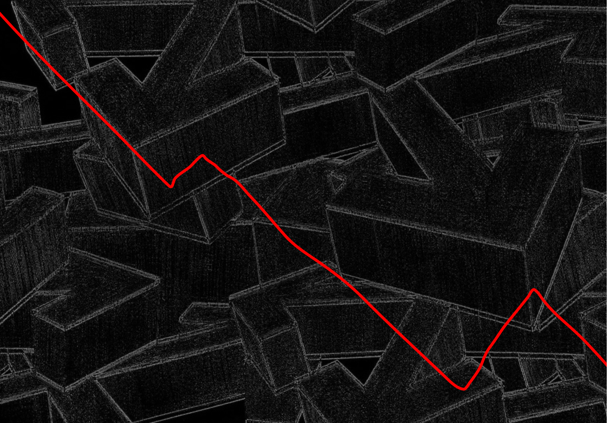
Line chart trending down
Saving the world
Saving the business

When budgets are tight, the case for investing in design needs to be even tighter.

Until early 2022, companies focused on talent retention at all costs. Now forced to downsize, these same organizations are starting to reverse policies centered on employee benefits and quality of life—removing perks, changing remote work policies, cutting the budgets of entire teams, and taking other unpopular measures intended to improve productivity and reduce costs. On top of this, some companies are banning political conversations in the workplace and rapidly pulling back on DEI initiatives

Within the design discipline, the rise of the Growth Designer role—a designer who is focused on acquiring new customers and bringing in immediate revenue—shows that companies are being more pragmatic about the Return On Investment (ROI) when making hiring decisions. Many designers who started a UX career with the goal of advocating for users are seeing their role shift to one that is focused on boosting company profits at all costs.

After so many years advocating for “a seat at the table”, designers are now being asked to split the bill.


🫠

🫠

Specialized thinkers
Resourceful makers
 

Shrinking headcounts increase the demand for generalist designers and hands-on leaders.

With many companies announcing hiring freezes or staff reductions, hiring managers tend to prioritize candidates who can wear multiple hats over those with hyper-specialized skill sets. While open positions are shrinking, the number of newcomers continues to increase year after year—generating more competition among entry-level designers and making it harder for folks to find their first job.

The gap between what’s taught in design school and the demands of a design job is wider than ever. Designers who do land a position are expected to deliver a lot more work, at speed, and with little room for error.

On the senior side of the spectrum, the ongoing trend of managers shifting back to hands-on positions shows no sign of slowing down. Companies cannot afford leaders who are only good at talking and not as good at delivering. The last thing they want is territorialism, silos, and the “this is not part of my job description” mentality. Since next year’s economic landscape isn’t clear and teams continue to be spread thin, watch for burnout within your team and keep track of your own resignation tendencies.


Dwight from tv show the office holding a sign that shows an acronym of his own name, determined, worker, intense, good worker, hard worker, terrific
 
Group thinking
Bias towards action

Too many circular conversations and not enough decision-making is undermining design work. It's time to rethink how we collaborate–with a focus on making things happen.

One meeting is over, and we jump right into the next one. Everyone has an opinion but no one has a decision. Technically, the work is getting done and items are crossed out of the agenda, but there is an unsettling feeling that the team is just pushing through deadlines rather than executing a vision. 

What if we focused less on giving each other status updates and shifted the discussion to the work itself?

Now is the time to double down on our bias toward action. If you disagree with a decision made by the team, bring alternatives forward. If the team feels stuck, create a framework for decision-making. Sometimes you need to be a fixer, other times it’s better to be a driver.

We are often afraid to let go of certain steps of the process, thinking it will undermine the value of design. But not moving things forward is even worse. As soon as we start delivering, we add clarity. Deliver something every day—whether a prototype or a bullet list—to ensure collaboration is not just sharing opinions but actually building something together.


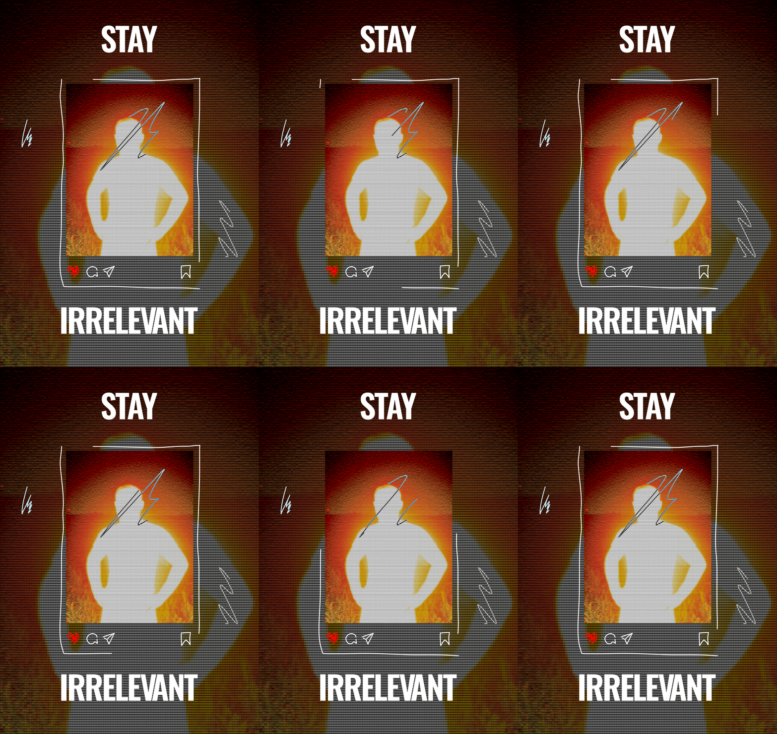
Scribble of social media post with human silhouette that reads stay irrelevant

Art direction by Manoel do Amaral
Scribble of social media post with human silhouette that reads stay irrelevant
 
Thought leadership
Algorithm-driven leadership

Social media influencers have taken the spotlight from design researchers and authors. And now it’s the algorithm that’s driving the design discourse.

Thought leadership has been a divisive topic in design: while some designers find in it a way to share knowledge and build reputation, others think influencers are abandoning the craft in pursuit of fame. Still, in the early days of social media, we were able to choose who we followed and who we looked up to.

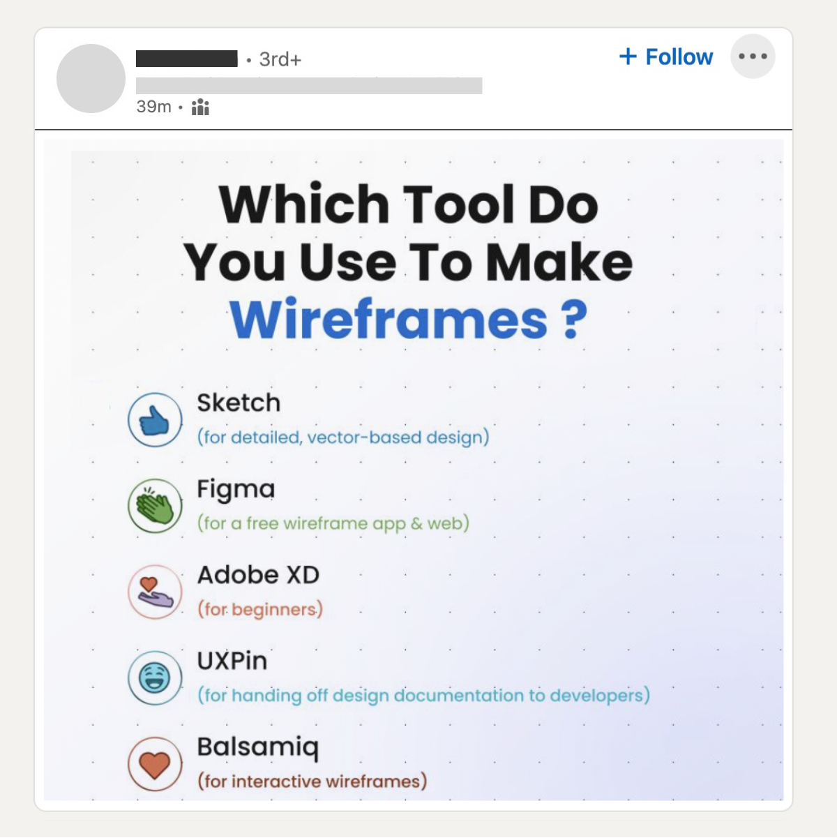
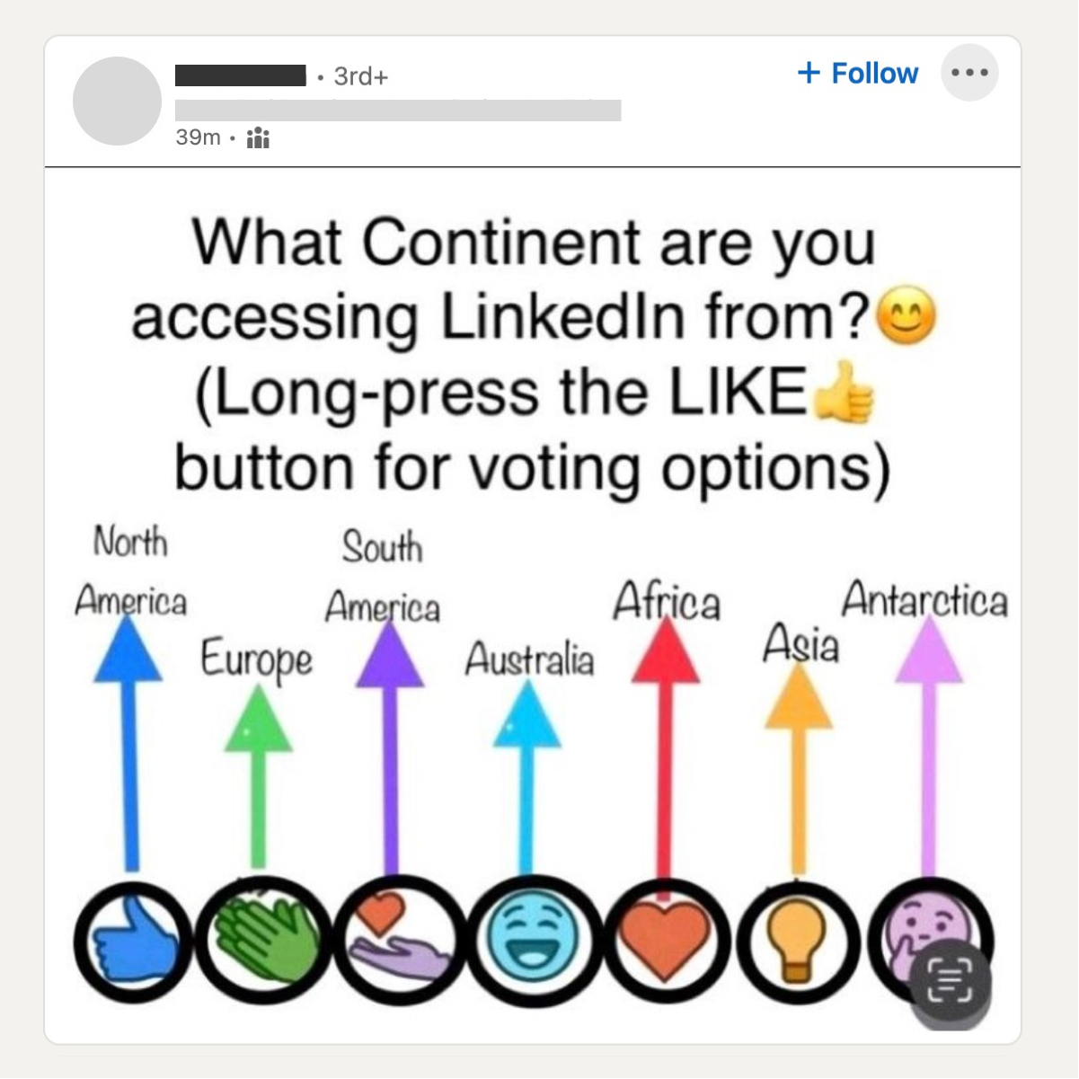
This is changing: now it’s an algorithm that selects what we see, keeping our feeds on TikTok, Instagram, and Linkedin well fed. When we don't have a choice about who we are really following, the platform prioritizes what works best for them: the most polarizing (clap if you agree, share if you don't), short, and prescriptive posts.

Post on Linkedin asking people to react with a different emoji based on which continent they are accessing from

The types of posts that go viral in design communities based on engagement metrics.

When content is shorter and maximized for engagement, we often lose track of the origin, history, and context behind it: a new designer is more likely to hear about a UX law from a UX influencer on an Instagram carousel than through the actual research which brought it about.

The lack of nuance from algorithm-suggested posts undermines any value we could get from them. For a discipline known for asking "why" and for striving to understand users’ context, it’s time we become more intentional about our own information sources.


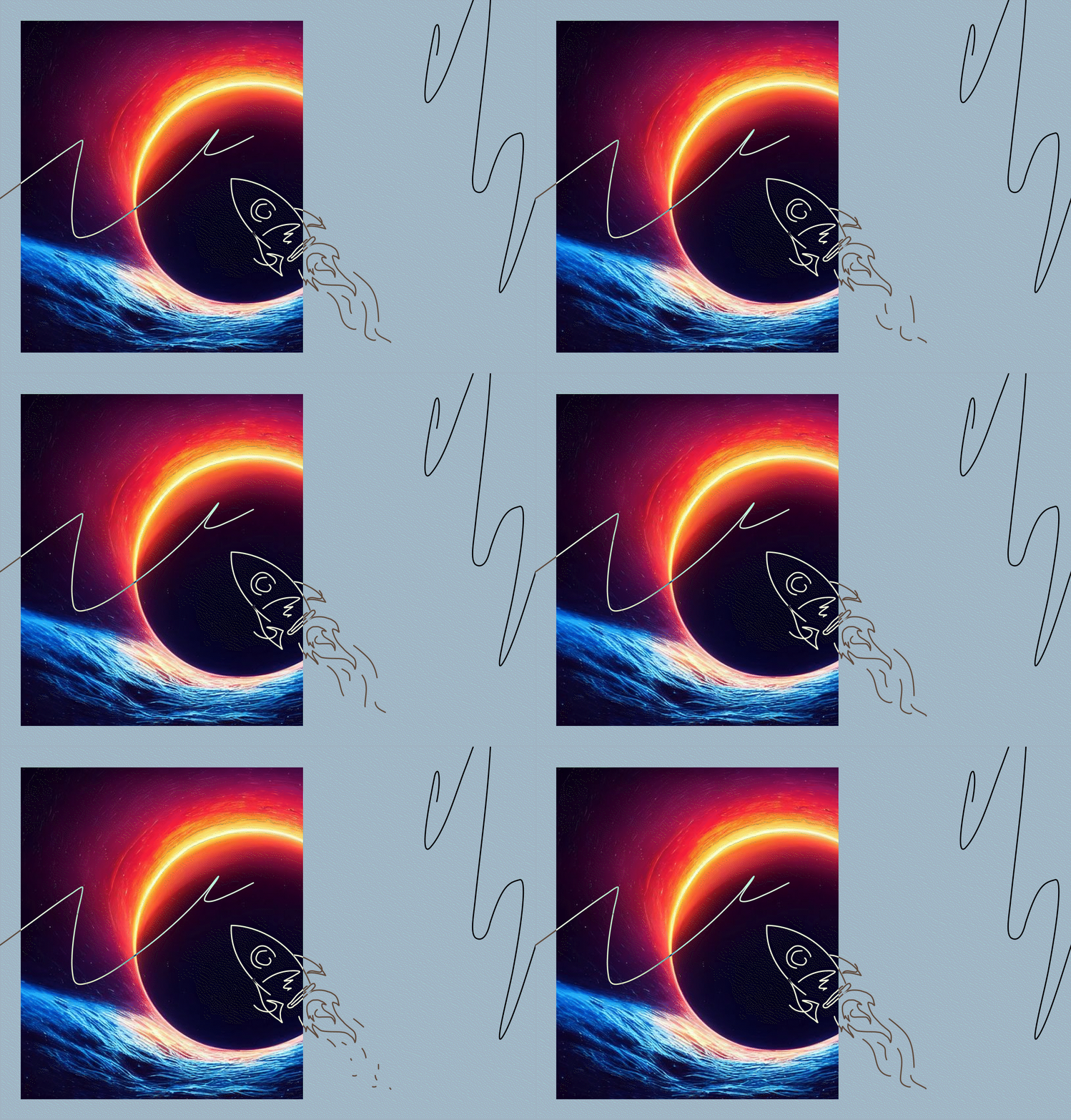
Rocket scribbled over an AI-generated eerie spatial image
A human-centered present
An inhabited future

While web2 keeps trying to make technology look and feel more human, web3 tries to make technology look more… technological.

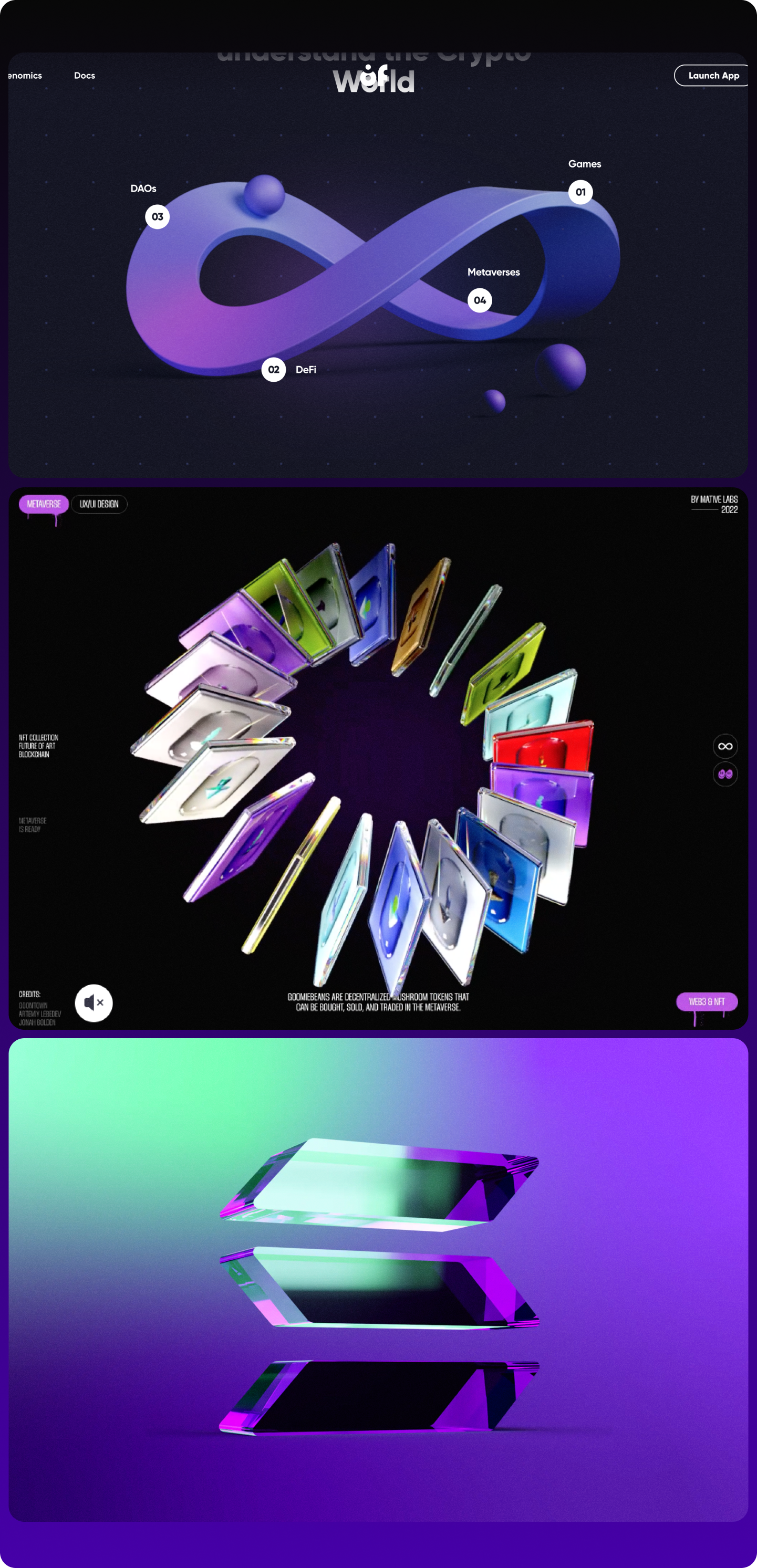
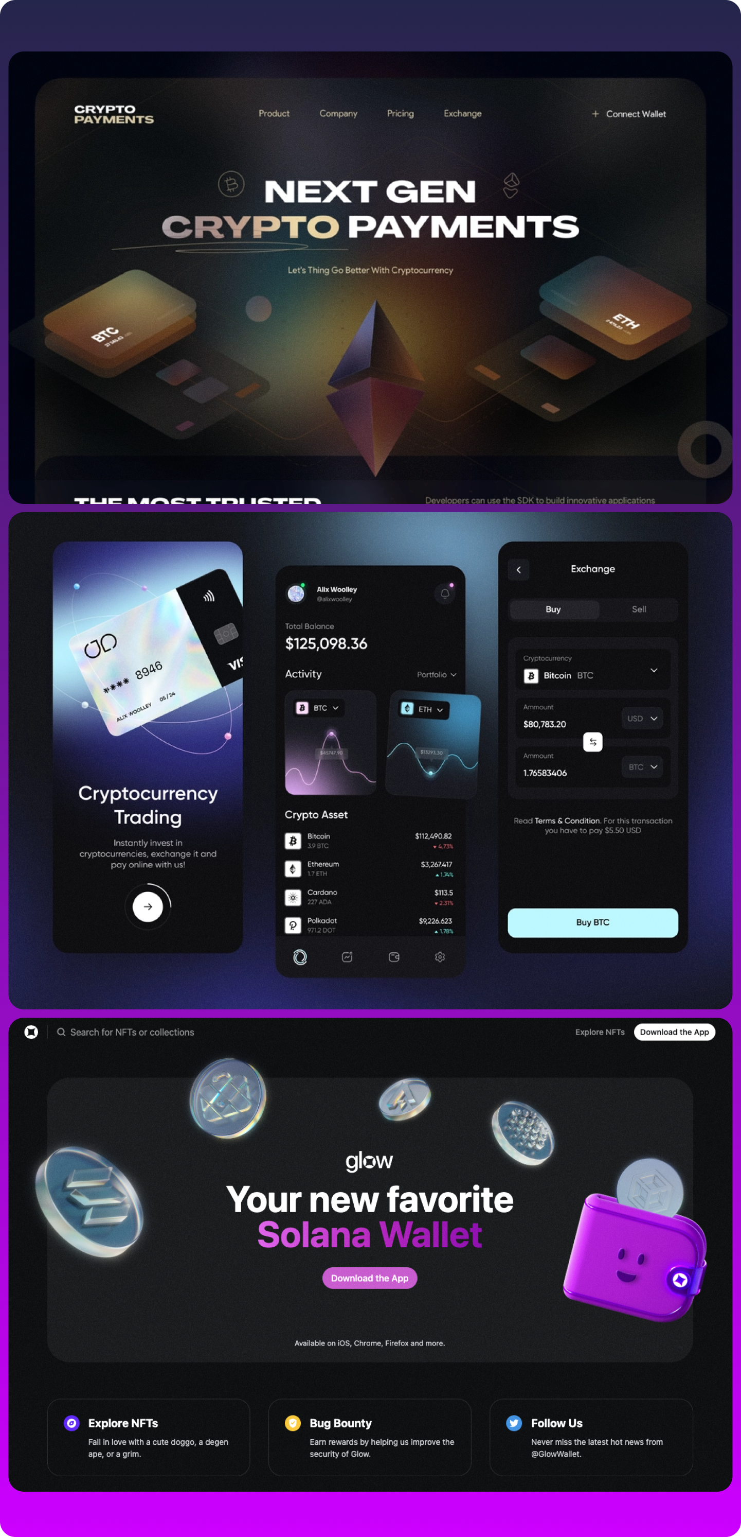
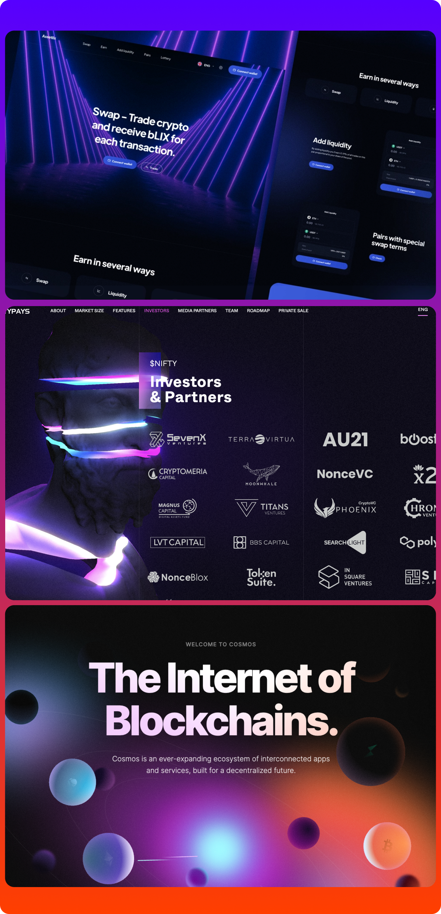
If the visual narratives broadcasted by web2 companies were built around putting people first (“focus on the customer and the rest will follow” and "don't be evil"), the new wave of web3 companies represents a shift in direction. There is no place for photos of women laughing alone eating salad, or flat geometric-style illustrations of humans on this new web. Instead of showing how products fit our lives, web3 aesthetics shifts the focus to showing an exciting yet-to-be-explored universe.


Board with screenshots of web3 services that use neon colors, abstract shapes and sci-fi-looking graphics

Many web3 projects are designed with neon colors, abstract shapes, and sci-fi-themed visuals — declaring war on the unsaturated and monotone web of the past, and announcing the boldness of a yet-to-be-explored future. More


Shifts in visual narratives happen every decade or so, so it’s not surprising that the design world is moving away from the corporate flatness of web2. Instead of reminding us of the problems of our current world and the harm that’s been caused by Big Tech, the new, abstract forms of web3 distract us from the crises of the day with the promise of a new virtual world.

Web3 companies seem to be saying that it’s easier to leave this world than to fix it.


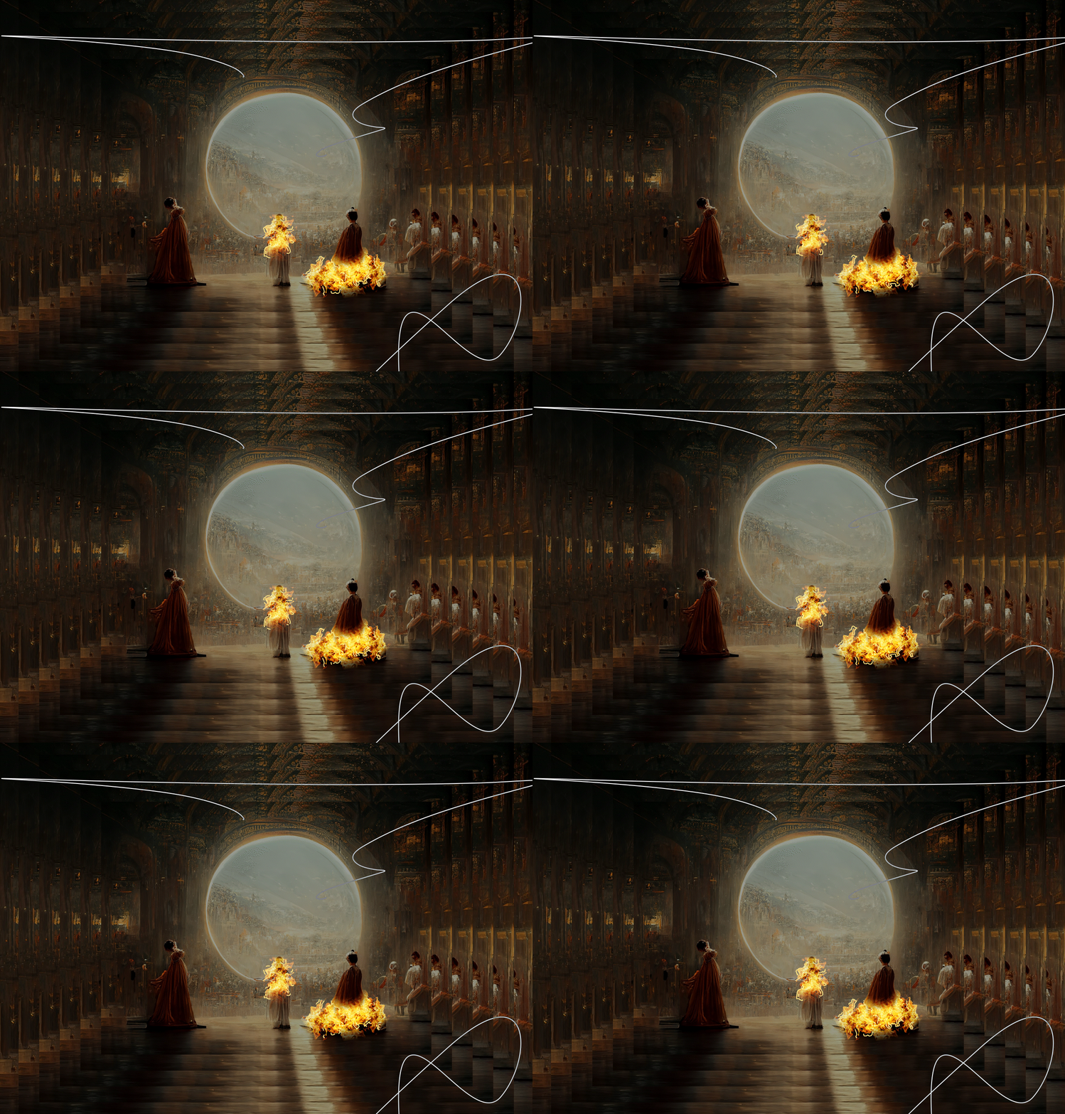
Photo composition of a well-known AI-generated image that won an art award, but with the subjects on fire
 
Science fiction
Design reality

Artificial intelligence is making its way to our design workflow faster than we're ready to accept.

In the past few decades, automated robots have made entire industries more efficient by reducing the need for manual labor. Now, in the fourth industrial revolution, the capabilities of Artificial Intelligence threaten to chip away creative labor as well (with AI-generated images even winning art competitions). The creative industry is on the verge of one of its biggest technological transformations.

AI is getting closer and closer to doing the work we do every day—although designers are still divided between embracing it or trying to keep it at bay. UX writers are both excited and scared by the rise of AI-assisted writing, while UX researchers are finding ways to help build trust in AI systems. Even within design publishing we’ve seen authors trade generic Unsplash stock images for those generated by Dall-e, Midjouney, Stable Diffusion, and similar AI.

Designers are already exploring different collaboration models with AI and creating Figma plugins to help them be more efficient in their day-to-day tasks. As our industry figures out the most robust use cases for this tech, our main advice is to keep an open mind: we want to be good at what we know, but even better at what we don’t know.


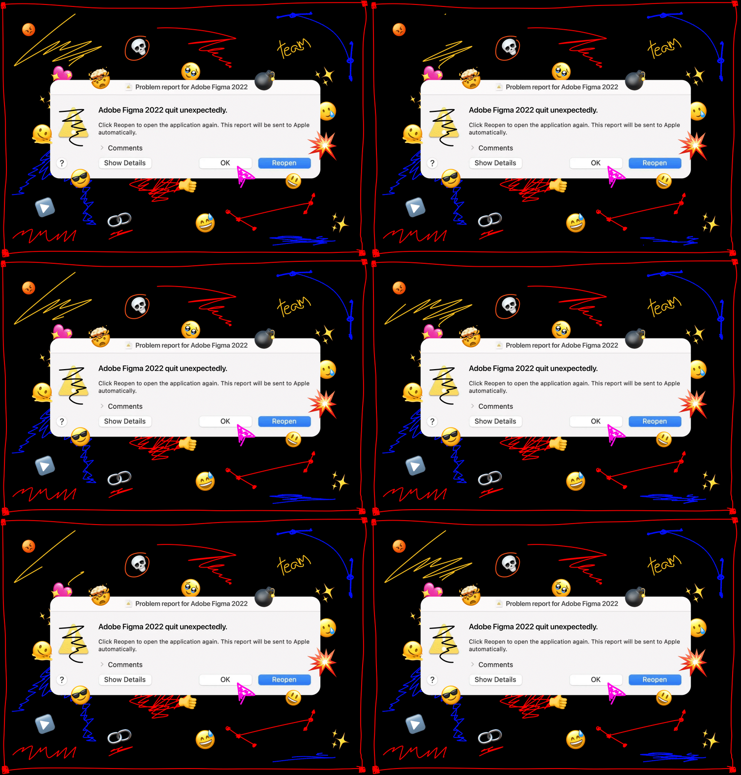
Typical computer alert of an adobe product quitting unexpectedly, but for Figma, with emojis and scribbles all over it
A designer's tool
A tool for design

Design tools are evolving to make us spend less time moving around boxes, and more time having the right conversations with the right folks.

Figma disrupted the industry with a browser-based, collaboration-focused design tool. They also invested in building community and connecting with a new audience of designers less interested in two-thousand-dollar conferences with long lectures and more interested in short talks available online for free. The US$20B acquisition of Figma by Adobe validates this approach at an enterprise level.

As design tools move upstream to big enterprise companies, new paths open for future design tools. Today’s designers are following open-source protocols to design more freely, connecting with development workflow to improve hand-offs, and augmenting design systems powered by AI capabilities

The biggest lesson from the Figma acquisition by Adobe is that design tools aren’t just drawing tools: the ability to move boxes around and draw lines is a given.

Real design happens when the tool gets out of the way, enabling people to talk, comment, see each other in real time, co-create, and make space for collaboration. If anything, this year has proven that the best design tools are also conversation tools.


Person hugging a pillow, maybe screaming maybe just seeking comfort
 
Going the extra mile
Taking an extra minute

Pushing ourselves too hard is breaking us as individuals. It's time to recalibrate our priorities if we want to be in this industry for the long game.

Designers have always felt the need to go the extra mile: many of us spend our free time creating side projects, taking on freelance work, moonlighting at startups, mentoring protegees, sharing content online and trying to prove ourselves to others. At our workplace, we push ourselves to break into the industry, get that promotion, earn recognition from our managers, and have a seat at the table. 

We conflated our employer’s growth with our own. We lost track of time and burned ourselves out. To solve this mess, we need to decouple ourselves from our work and rethink what we really expect from it.

We need the time, space, and agency to grow at our own pace. We need to untangle the idea of progress from the idea of making new things, and start seeing maintenance and self-care as equally important, if not more so. We need to find meaning in our work but also outside of it. In the long run, consistency is more important than intensity

We will need to be there for ourselves tomorrow, regardless of how things went today. Drink water, be kind to yourself, and stay true to what you hold dear. Bring your best to your work, but give yourself an extra minute.


Uncertainty is the only certainty there is.
 

2022 taught us a humbling lesson on volatility and change. A year that started with the unparalleled promise of web3 (and the acronym party of NFT, DAO, DEX, DeFi), ended on a different and less energizing note. Faith in crypto is shrinking, the metaverse has now become an expensive joke, and web3 startups are trying to force unimaginable use cases down everyone’s throats. 

The real lesson of the year is about the fictions we tell ourselves: how we build up and disown idols overnight and how we can learn from the bitter taste of reality checks.

Our hope is that we all enter 2023 prepared to challenge things more. To challenge what we see around us (the hype, the buzzwords, the inflated excitement around us), but also to challenge ourselves. We should question the way we work, what we truly value in our jobs, and what we consider “the right way to design.”

In times of change and turmoil, uncertainty is the only certainty there is. There is a vibe shift coming, and with it, a real opportunity to reshape the reality around us–and more importantly–ourselves.


Thank you for reading.

The UX Collective (ISSN: 2766-5267) is an independent publication built to help designers think more critically about their work. You can follow our content via Email, Medium, Twitter, Linkedin, Instagram.

For more in-depth pieces, check our new publication DOC.


Written by:
Fabricio Teixeira, Caio Braga

Art direction by:
Manoel do Amaral

Edited by:
Emily Curtin

Narrated by:
Laura Vandiver (audio version)

Published by:
UX Collective

Special thanks to:
Rafael Frota and the Brazilian UX community